Dashboards that carry their own quality state.
Charts, dashboards, embeds and alerts — built over governed measures, on the same substrate as ingestion. A published number arrives with the health of the data behind it, so a stakeholder sees whether it can be trusted, not just what it says.
A builder over measures, not a chart wizard.
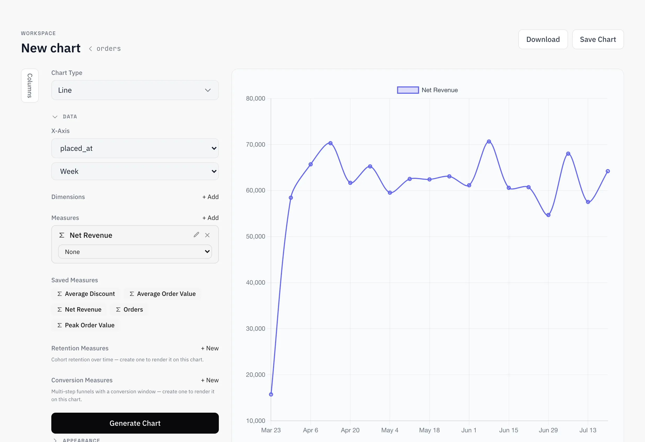
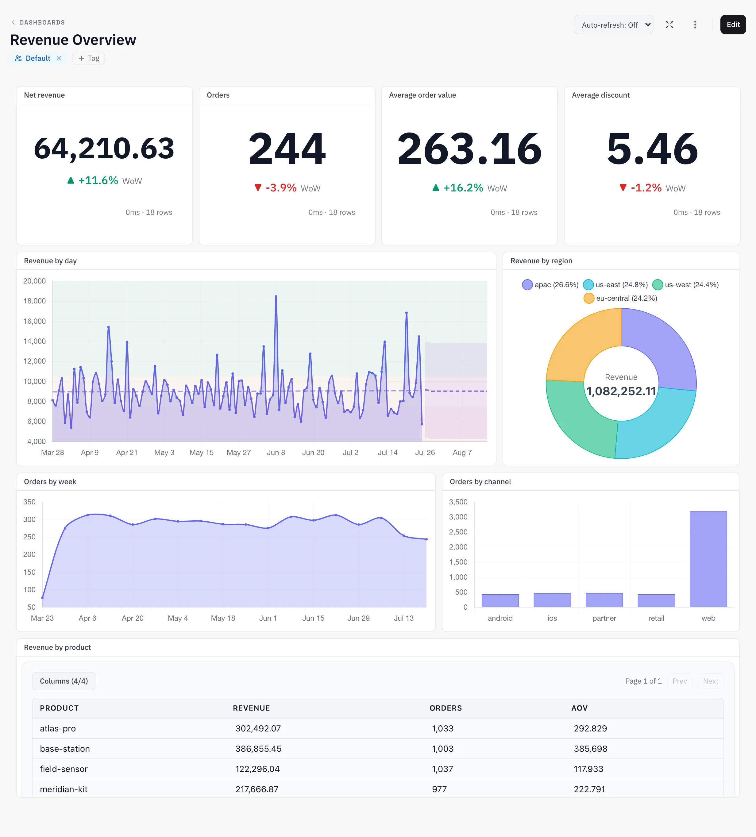
Pick an axis, apply a governed measure, generate. The builder reads the same catalog as everything else, so “net revenue” in your chart is the catalog's net revenue — with retention and conversion measures available where a plain aggregate isn't enough.
The chart draws its own forecast.
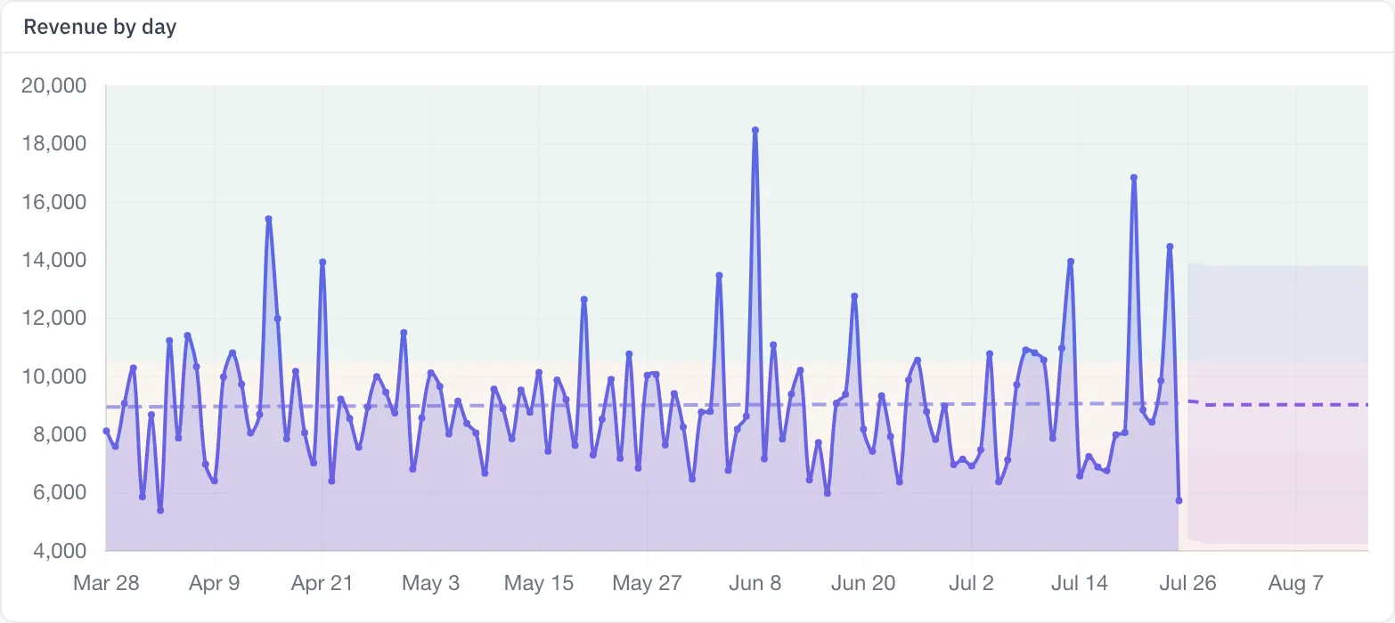
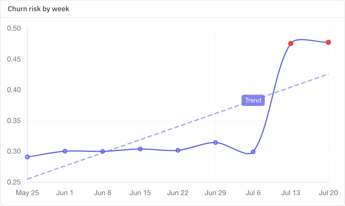
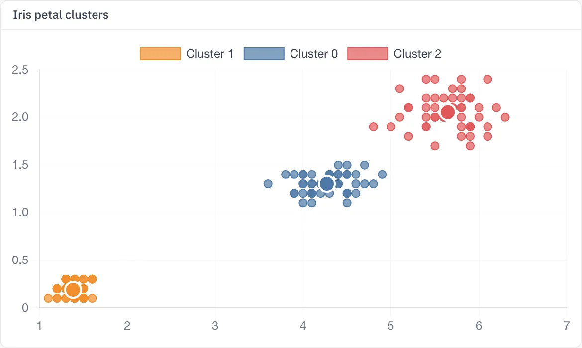
Any chart can carry a trendline and an ML overlay — a forecast continuing the series, anomaly flags on outliers, a regression, or k-means grouping on a scatter — computed by the platform's own ML engine at render time, on the same governed data. In a BI tool this is an export to a notebook; here it is a toggle on the chart.
Composed once, read everywhere.
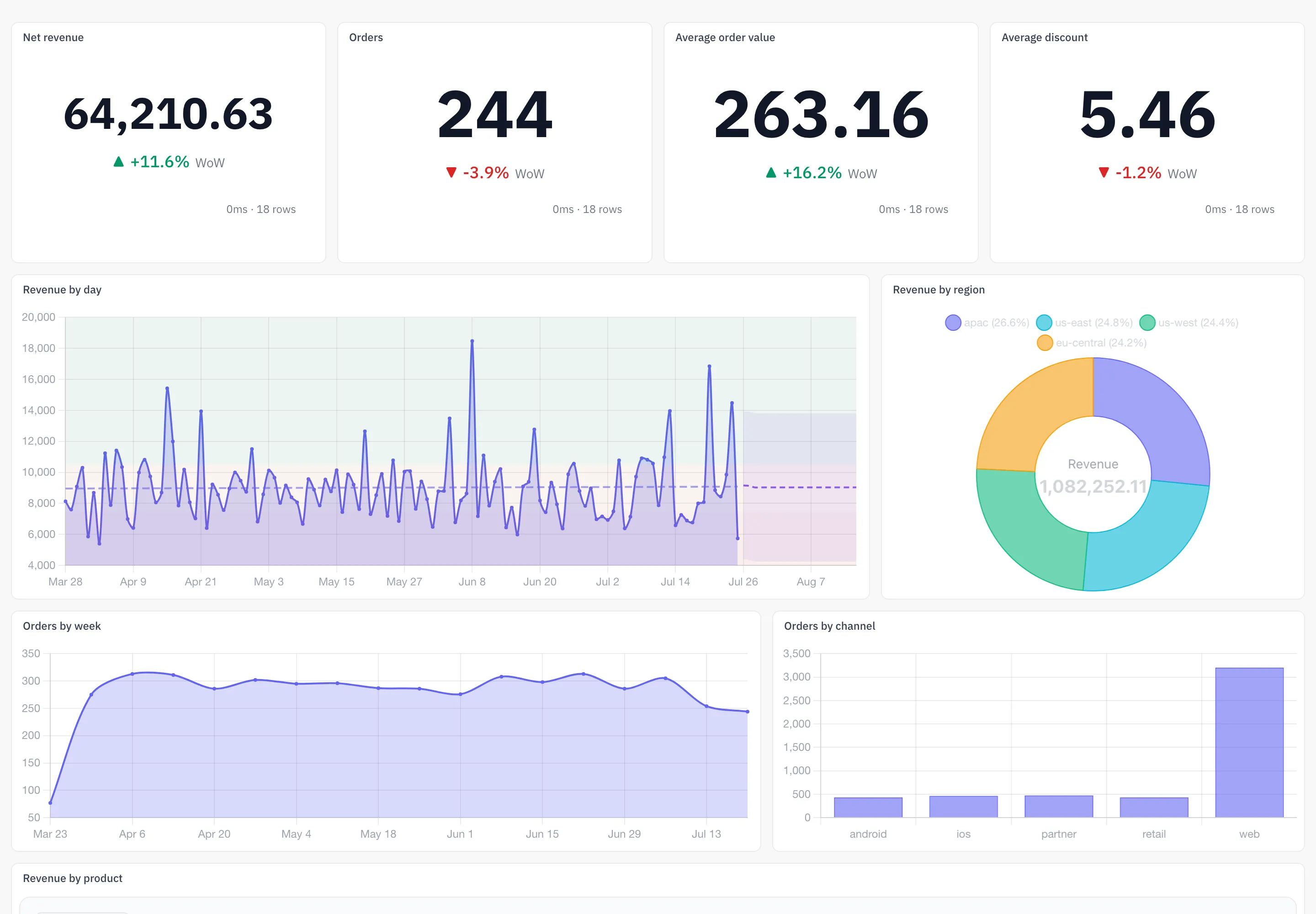
Dashboards are compositions of saved charts — KPIs, trends, breakdowns and tables on one grid, refreshed on their own schedule. Because the substrate is shared, the dashboard a VP reads and the SQL an analyst runs cannot quietly disagree.
White-label, outside your walls.
Any chart or dashboard becomes an embed: tokenised per viewer, row-scoped by the same permission model that governs the workspace, domain-locked, and stripped of product chrome. Your customers see their numbers and your brand — nothing else.
The dashboard tells you, not the other way round.
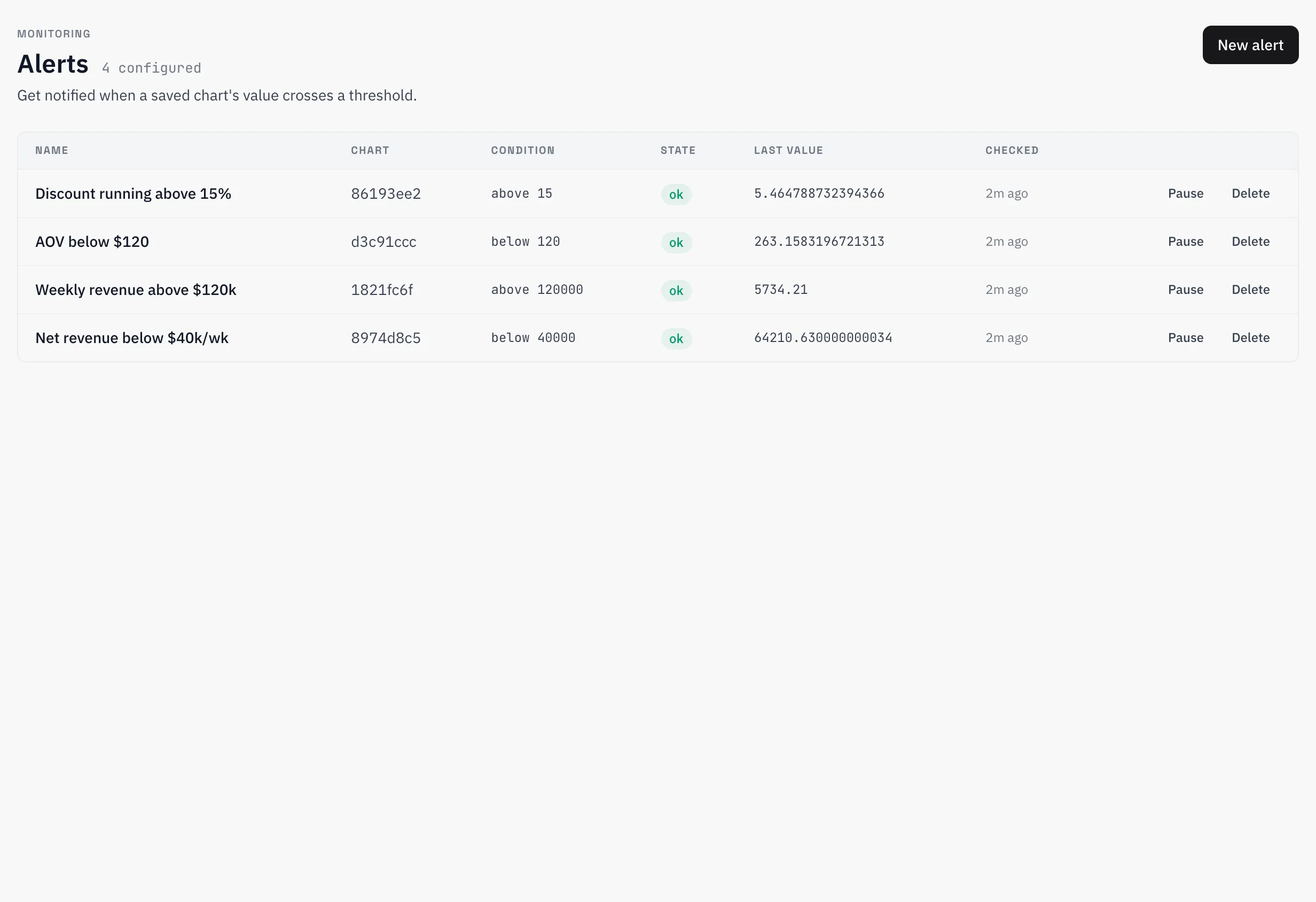
Put a threshold on any saved chart and get told — in the app, in Slack or by email — the moment the number crosses it. Checks run on their own schedule, record what they saw, and recover cleanly when the number comes back.
Ask in plain English. Answered from the catalog.
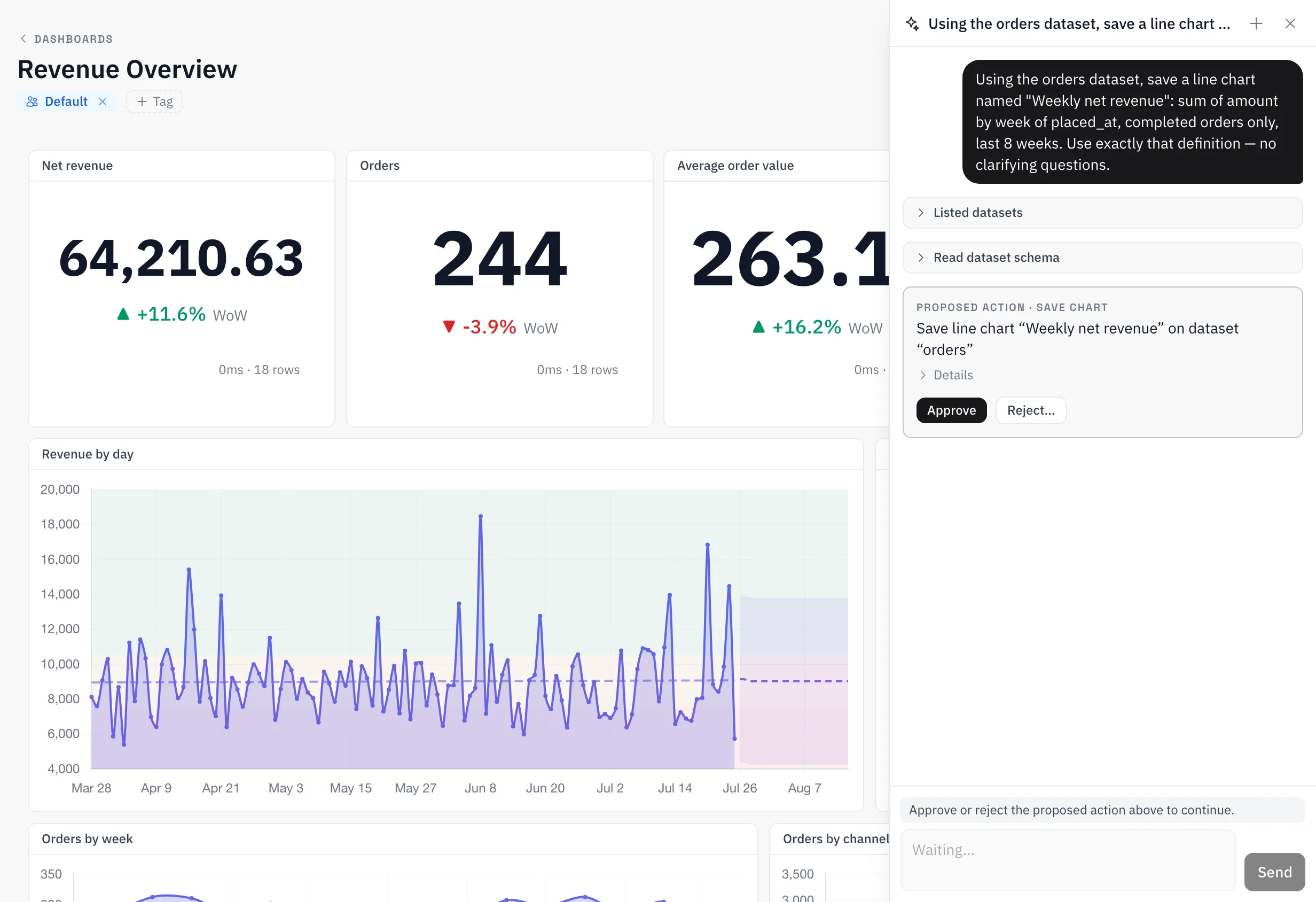
The assistant turns “how did revenue do last week?” into the governed answer. It reads the measure catalog and the dataset schemas it has actually explored — never a guessed column — and every change it suggests, from a chart to a quality rule, is proposed first and applied only after you approve it. It acts with your permissions, inside your org.
From CSV to defensible dashboard, today.
Upload a file, build a chart on a governed measure, and share a dashboard whose numbers you can stand behind.