Chart builder
Build 16 chart types from any dataset — columns with aggregations or governed catalog measures, per-measure filters, table calculations, and ML overlays.
The chart builder turns a dataset into a visualization without writing SQL: pick a chart type, drop columns onto measures and dimensions, and generate. Everything a chart needs — measures, filters, styling, annotations — lives in one saved config, so a chart you build once can be reopened, edited, and reused everywhere.
Build a chart
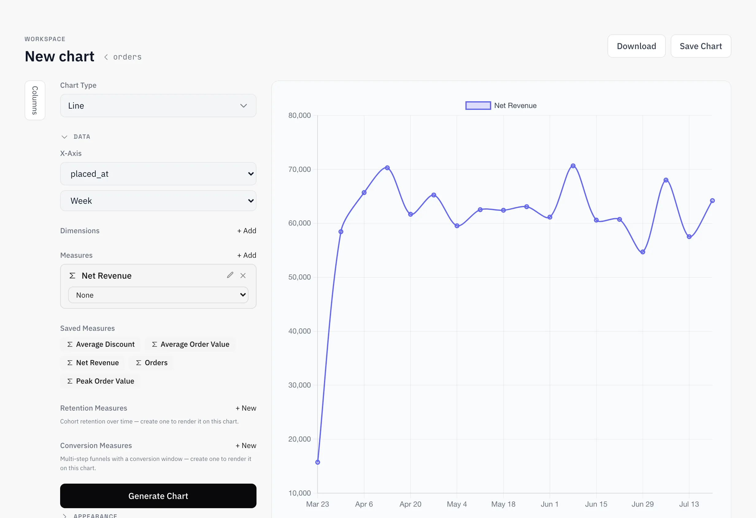
Pick a dataset, pick a chart type, then choose an X axis — for timestamps, a time grain buckets values anywhere from second to year. Add one or more measures, optionally split them by a dimension, and generate.
Chart-level filters narrow the data before aggregation, with operators from equals and ranges through in/like to relative date presets (“last 30 days”). Beyond the data itself, charts carry styling (palettes, dual axis, log scale), legends, trendlines, and annotations — date markers, shaded date regions, and horizontal reference lines or bands.
ML overlays add a computed layer on top of the series: forecast, regression, anomaly detection, or clustering.
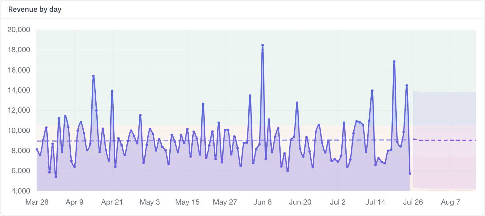
Chart types
There are 16 chart types:
| Type | What it shows |
|---|---|
line | Values over a continuous axis, usually time |
area | A line chart with the region under it filled |
combo | Line and bar series mixed in one chart — each measure picks its type |
bar | Categorical comparison — vertical or horizontal, stackable |
scatter | The relationship between two numeric columns, with optional grouping |
pie | Share of a whole |
doughnut | Pie with a center total — the total is a server-computed grand aggregate, never a sum of the visible slices |
funnel | Step-by-step drop-off through an event sequence, with an optional conversion time window |
kpi | One headline number, with optional comparison indicator and sparkline |
gauge | A value against a min–max range with colored zones |
progress | A value against a goal |
table | Rows with grouping, totals, conditional formatting, heatmap columns, and a pivot column |
boxplot | Distribution per category, with optional outliers |
radar | Several values compared across axes on a circular grid |
map | Geographic data — three sub-types below |
ai_text | A narrative text card whose numbers are engine-computed measure values — exact numbers, never model-generated prose |
Maps come in three sub-types: choropleth colors countries or subdivisions from a location column; bubble places sized points at latitude/longitude coordinates; heatmap shows point density with configurable intensity and radius. Ten color scales and light, dark, and voyager base styles are built in.
AI text cards render a template whose {name} references resolve to measures — each one a column plus aggregation or a governed catalog metric, computed by the query engine. The model shapes the sentence around the numbers; it never invents them.
Measures & aggregations
A measure is a column plus an aggregation — or a governed catalog measure picked by name, so the definition stays consistent across every chart that uses it. Available aggregations: SUM, AVG, COUNT, COUNT_DISTINCT, MIN, MAX, MEDIAN, STDDEV, STDDEV_POP, VARIANCE, VAR_POP, APPROX_DISTINCT, APPROX_MEDIAN — or no aggregation at all to plot raw values.
Each measure can carry its own inline filters, compiled server-side to AGG(...) FILTER (WHERE ...) — so one measure counts completed orders while the one next to it counts all orders, on the same chart, in one query. Dimensions split a measure into one series per value; per-series you can set a color, an alias, and on combo charts whether the series draws as a line or bars.
Retention and conversion measures — governed from the catalog or defined inline on the chart — take over the render: retention draws cohort grids, conversion draws step funnels and trends. See Product analytics.
Table calculations
A table calculation transforms a series after aggregation — the query stays the same, the display changes:
| Calculation | Result |
|---|---|
pct_of_total | Each point as a percentage of the series total |
running_total | Cumulative sum up to each point |
difference | Change from the previous point |
pct_difference | Percent change from the previous point |
pct_from | Each point as a percentage of the first point |
rank | Rank by value, 1 = highest |
percentile | Percentile rank, 0–100 |
moving_avg | Moving average over a configurable window (default 3 points) |
Calculations run per series — a dimension-split chart computes each series independently — and on table charts a measure can also partition its calculation by a column, so a running total or moving average restarts per group instead of running across the whole result. When every measure on a chart produces percentages, the Y axis formats as % automatically.
Save & reuse
Saving a chart stores its full config in the catalog; reopening it restores the builder exactly as you left it. Saved charts are the unit everything downstream works on: dashboards arrange them, threshold alerts watch them, scheduled deliveries snapshot them, and embeds publish them outside the app.